Designing a strategic solution that improves the home page of a global consulting firm
THIS CASE STUDY IS ABOUT:
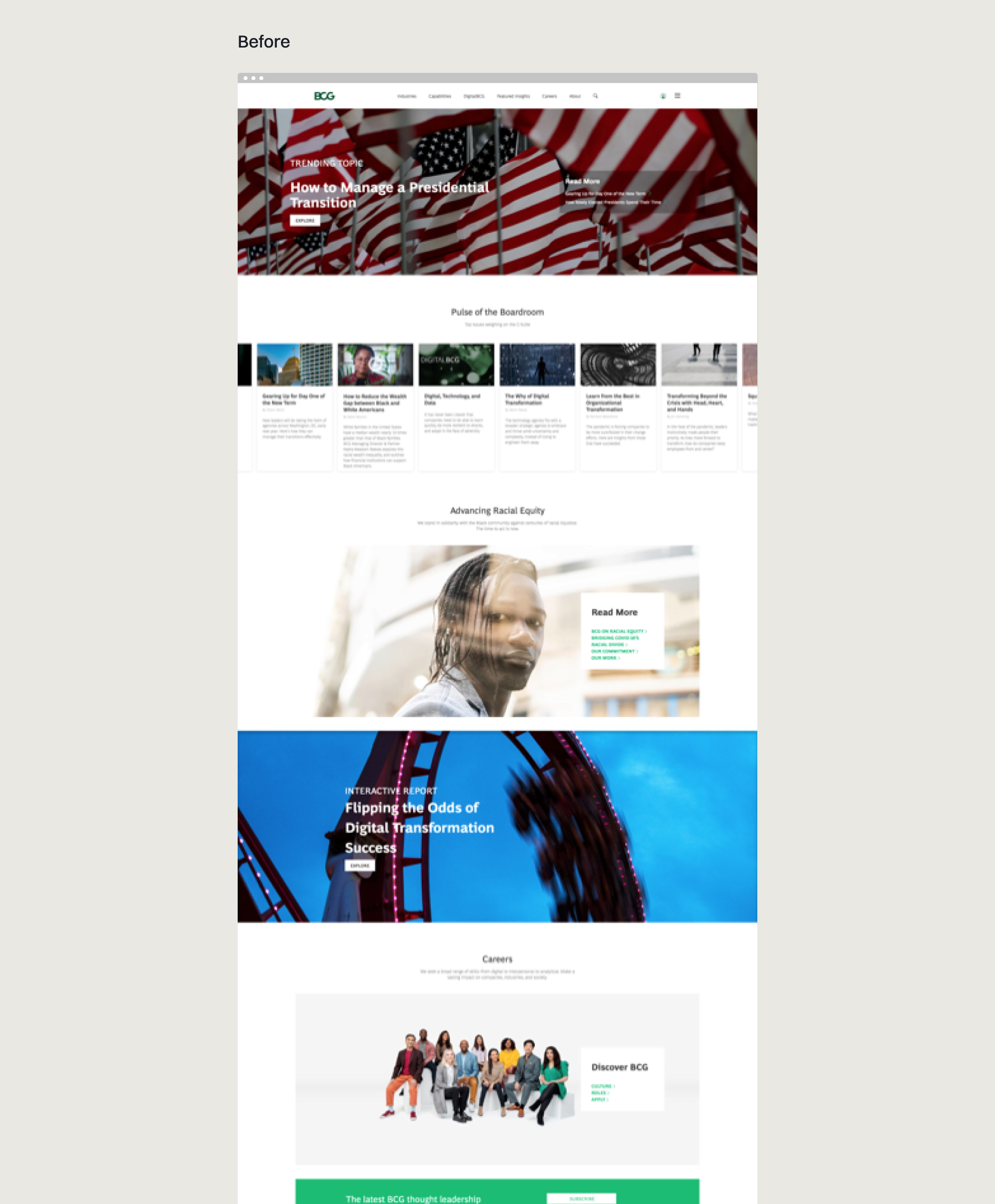
The redesign of the home page of a global consulting firm—which included an updated design system and a flexible module library with interchangeable modules that resulted in increased engagement to other areas of the website.
This case study aims to:
Give a better understanding of how I approach UX design to solve a complex problem— and how it interplays with teamwork.
this case study will cover:
Project Background
Get some context behind the project
Context
Background
The consulting firm's marketing team approached our Design Team and tasked us to redesign the firm's home page to increase user engagement in a sprint that lasted 2.5 months.
Deliverables
UX Documentation
Module Library
Design Guidelines
High Fidelity Prototype
The Team
1 Project Manager
1 Strategist
5 Designers
My Responsabilities
Lead
Led the UX Phase of the project—where I oversaw a group of designers through a series of activities—that allowed us to uncover underlying pain points and strategize new approaches to solve the newly discovered problems.
Plan & Delegate
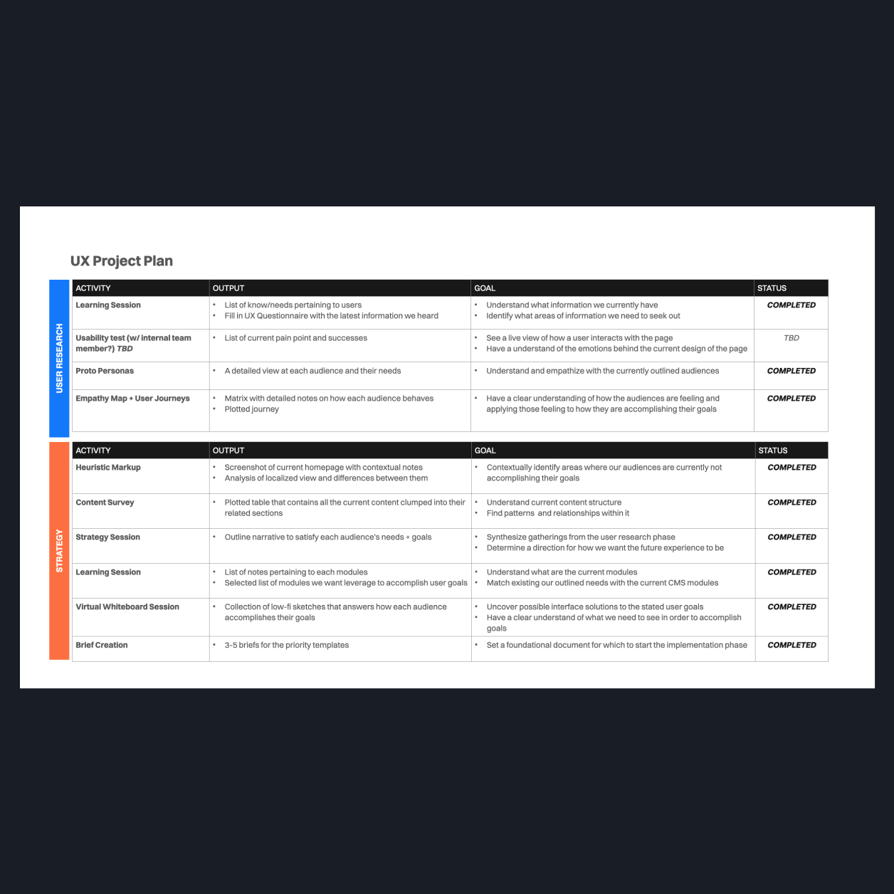
Created a UX Project Plan that served as a guiding strategy for our team to uncover key insights that informed our final design solution.
Design
Partnered with other team members to design deliverables across all phases, some of which included: wireframes, prototypes, presentations, and reference documents.
Uncovering the problem
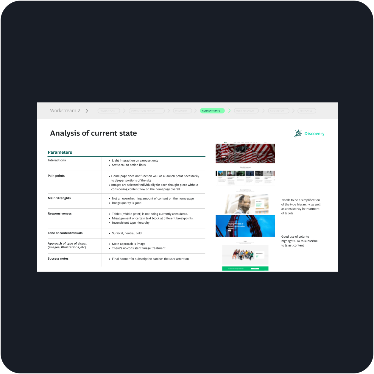
Some of the pain points we heard—
There is a very high bounce rate. Users are not interacting with our curated content pieces or going deeper into the site.
The homepage is currently focused on showing some content pieces but does not display a personalized experience for the user to engage with tailored content.
There is a lot of effort put into the newsletter, and currently, the subscription rate is very low.
Can we design a more thoughtful and efficient home page that increases brand awareness and user engagement—while also accomodating our existing CMS system?
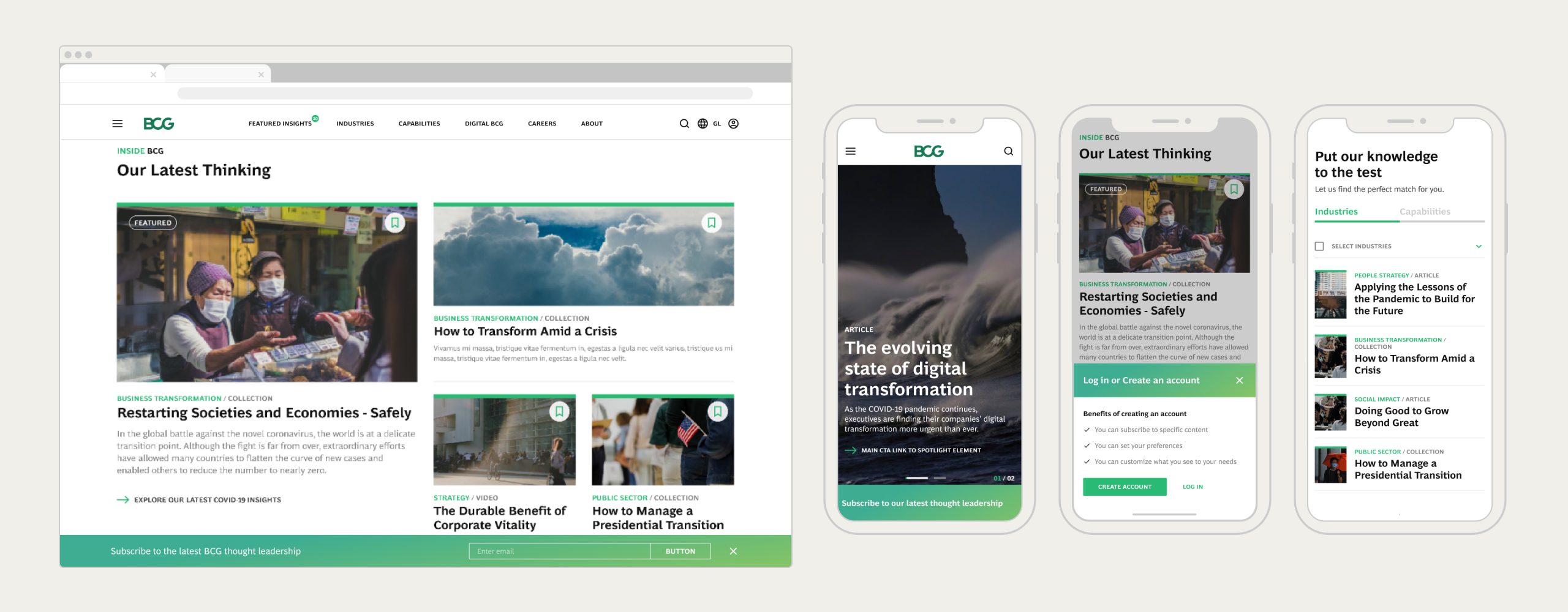
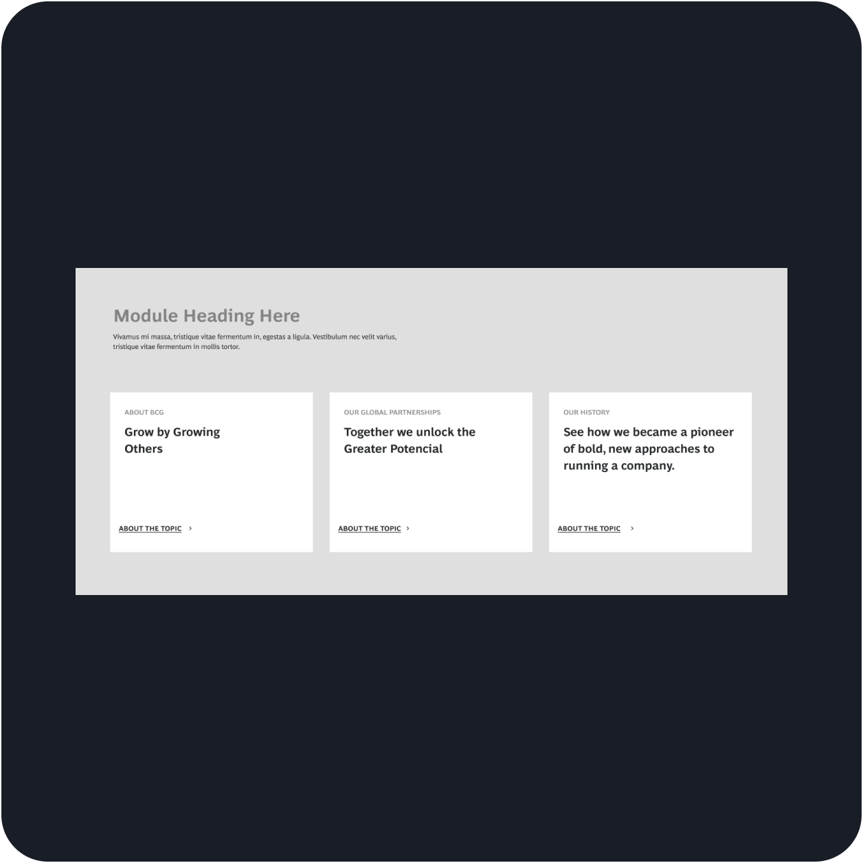
Created an updated module library that focused on having a simple design language, copy, and layout—where the user could discover more about the firm initiatives and get a personalized experience.
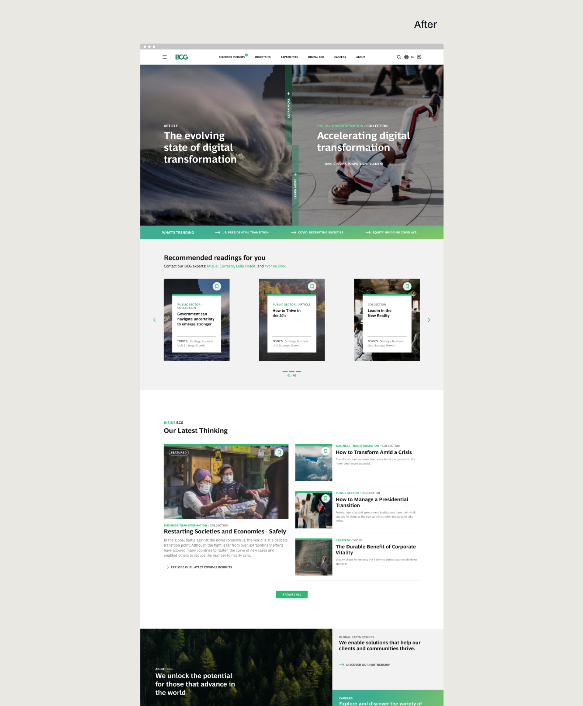
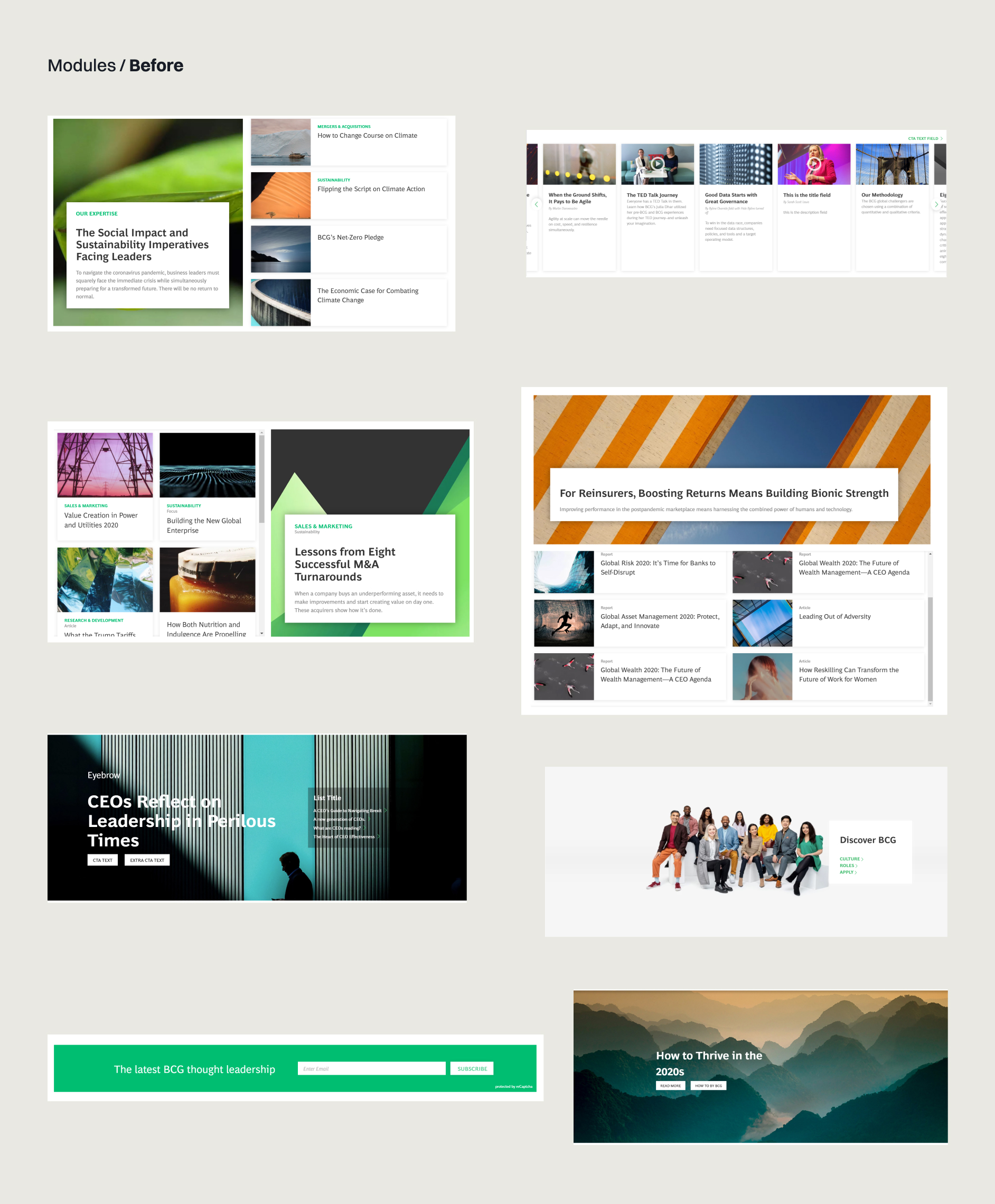
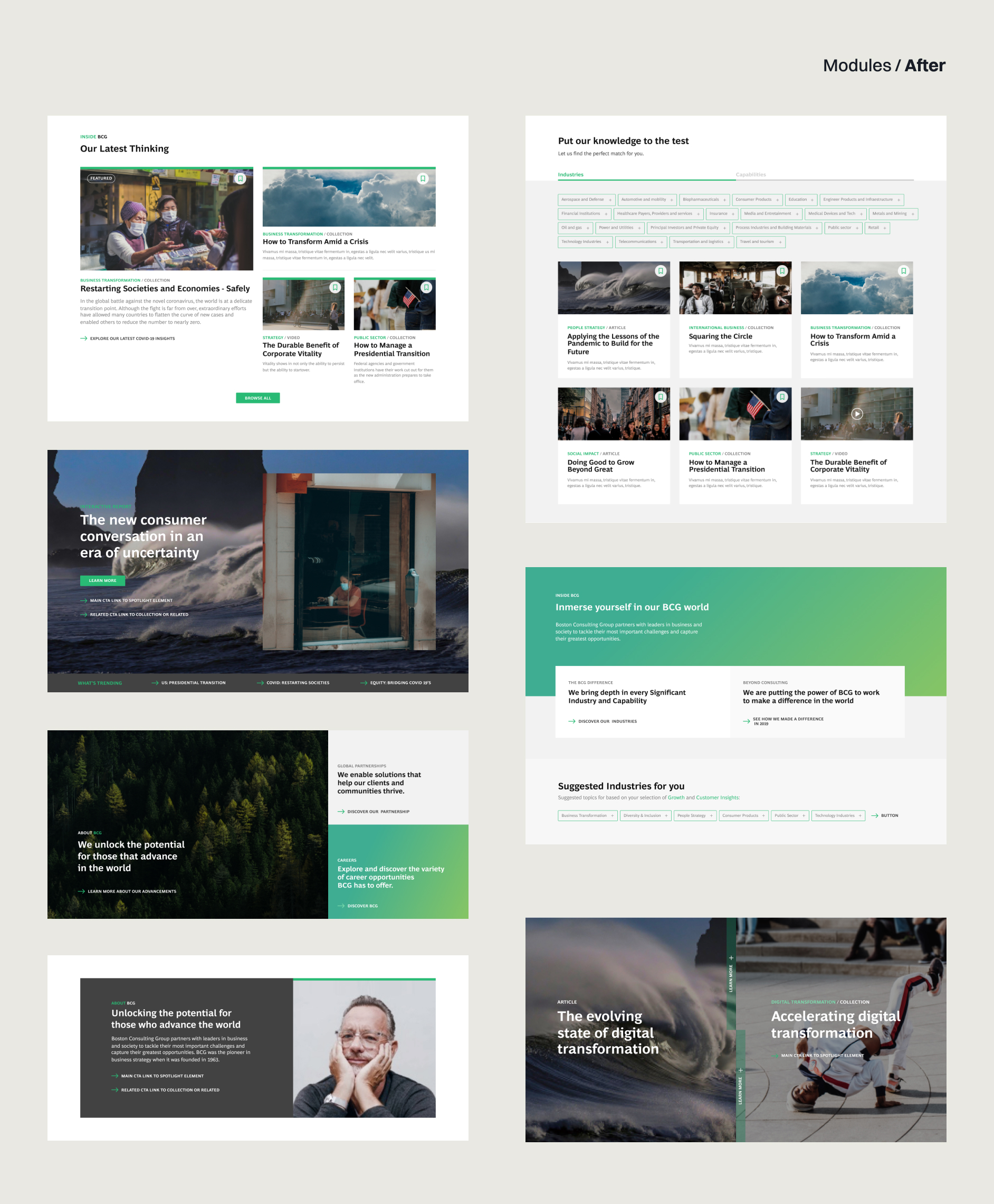
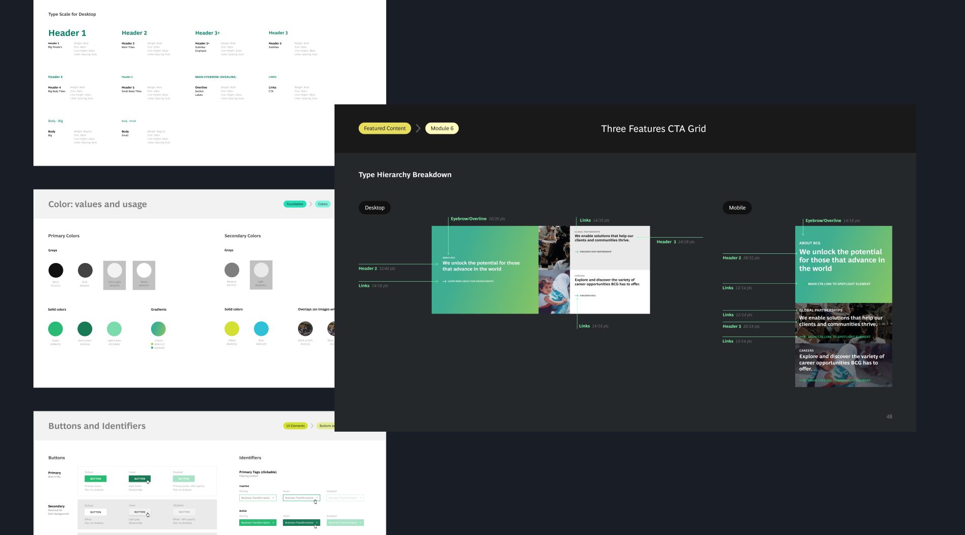
↓ This new module library focused on simple layouts and accessible copy that allowed for scanability and directed users to dive deeper into other sections of the firm's website. The newly updated design system includes simplified color gradient, iconography, and typography that reinforce the brand tone and make the overall experience more engaging.
This module library has—
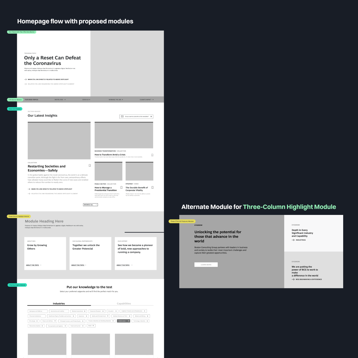
A flexible stacking approach, which lets the modules stack in a different order to create multiple cohesive layouts—that facilitates the process of the weekly updating of the home page
3 main groups of modules, each one tailored for a specific type of content (i.e. 'About Us' Content, 'Latest Articles' Content)
Consistent use of visual elements that reinforce the brand identity and enhance the overall page hierarchy
Key Elements of the Design
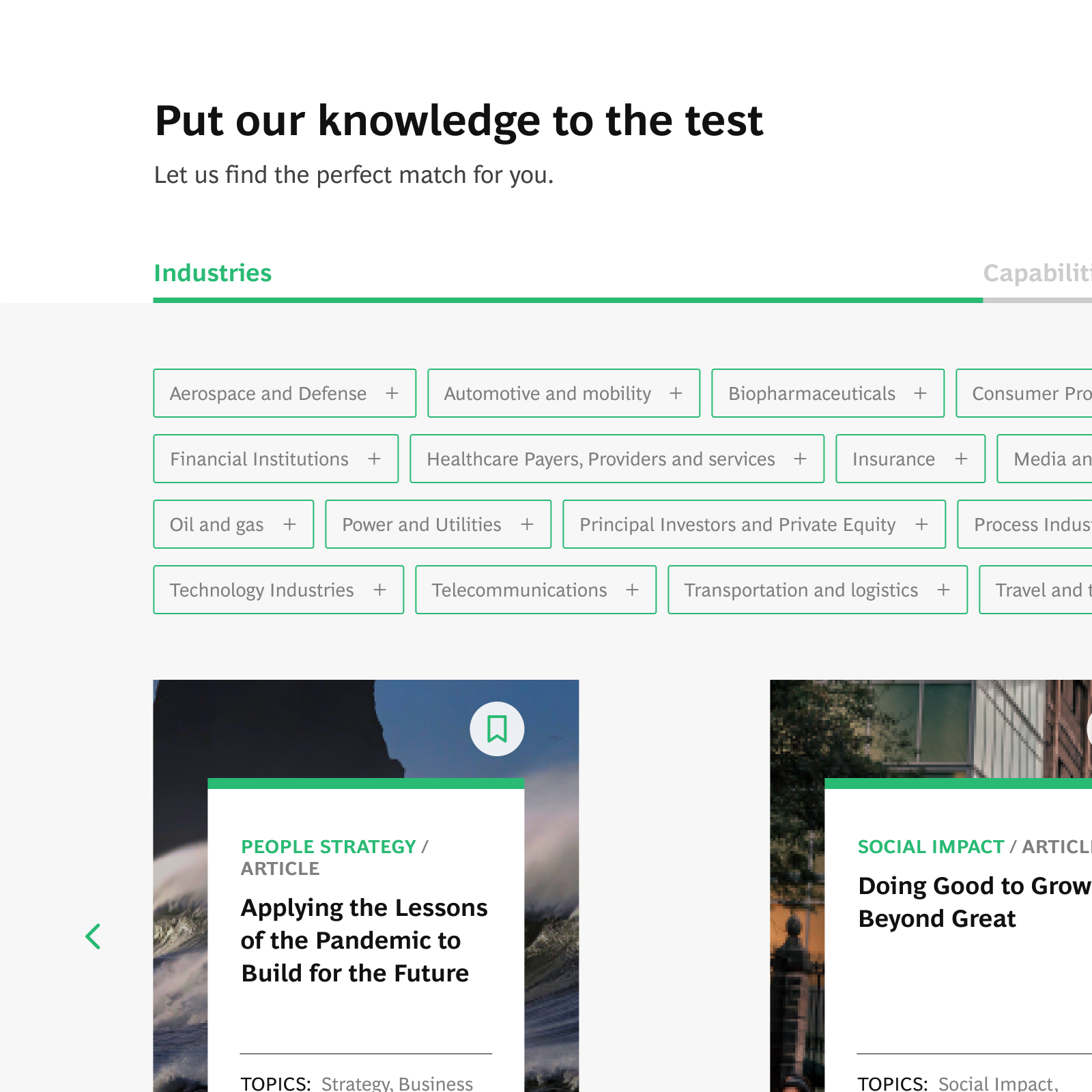
Enhanced interactivity in select components that lets the user explore the breadth of the business offerings, thus increasing engagement of the home page
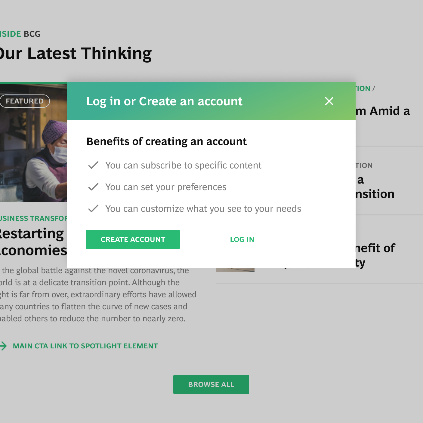
↓ Simplified modals, copy, and type hierarchy that informs the user of what to expect at each point of the design
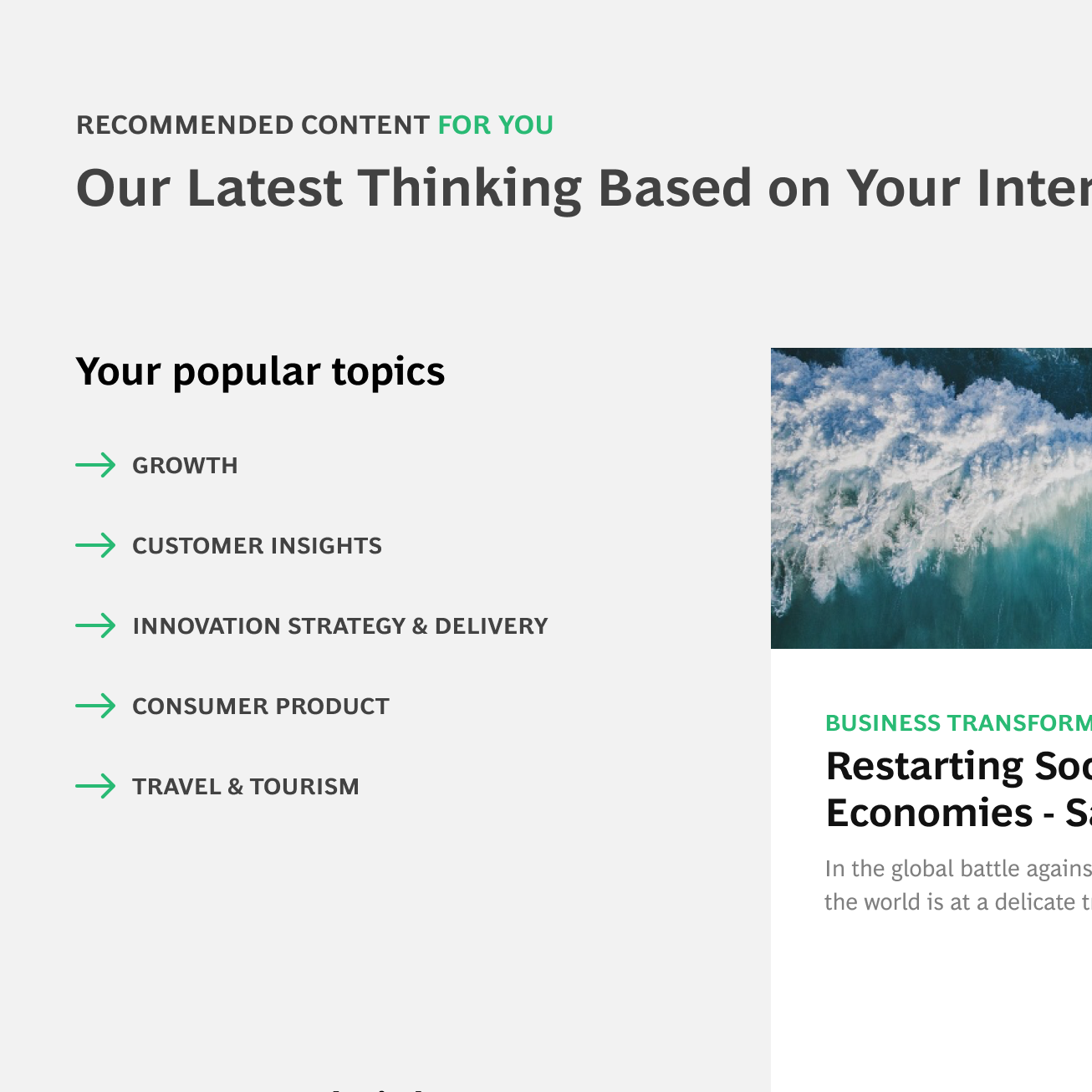
↓ Inclusion of new layouts that highlight personalized content to increase the return of users and promote the subscription
Each module was designed to be usable and accessible at each viewport—with thorough consideration of content, visual hierarchy, and interaction.
↓
Custom Dashboard
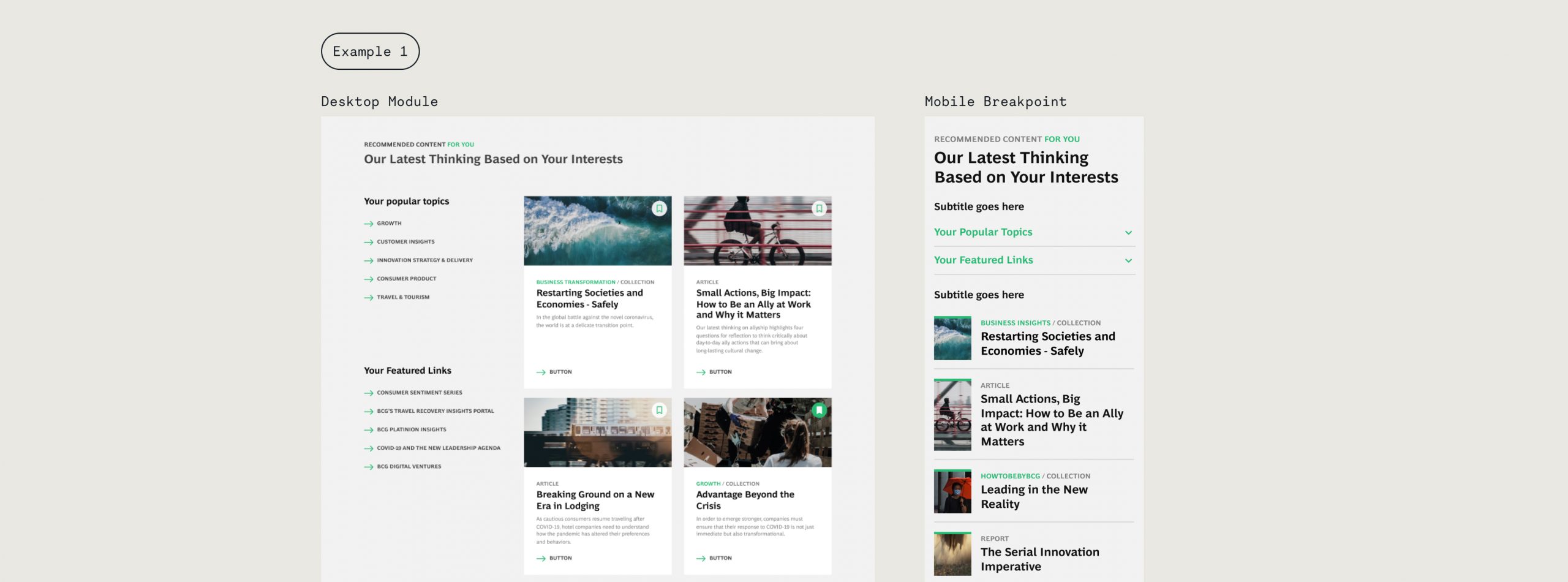
A dashboard that helps returning users get tailored content pieces related to their preferred topics
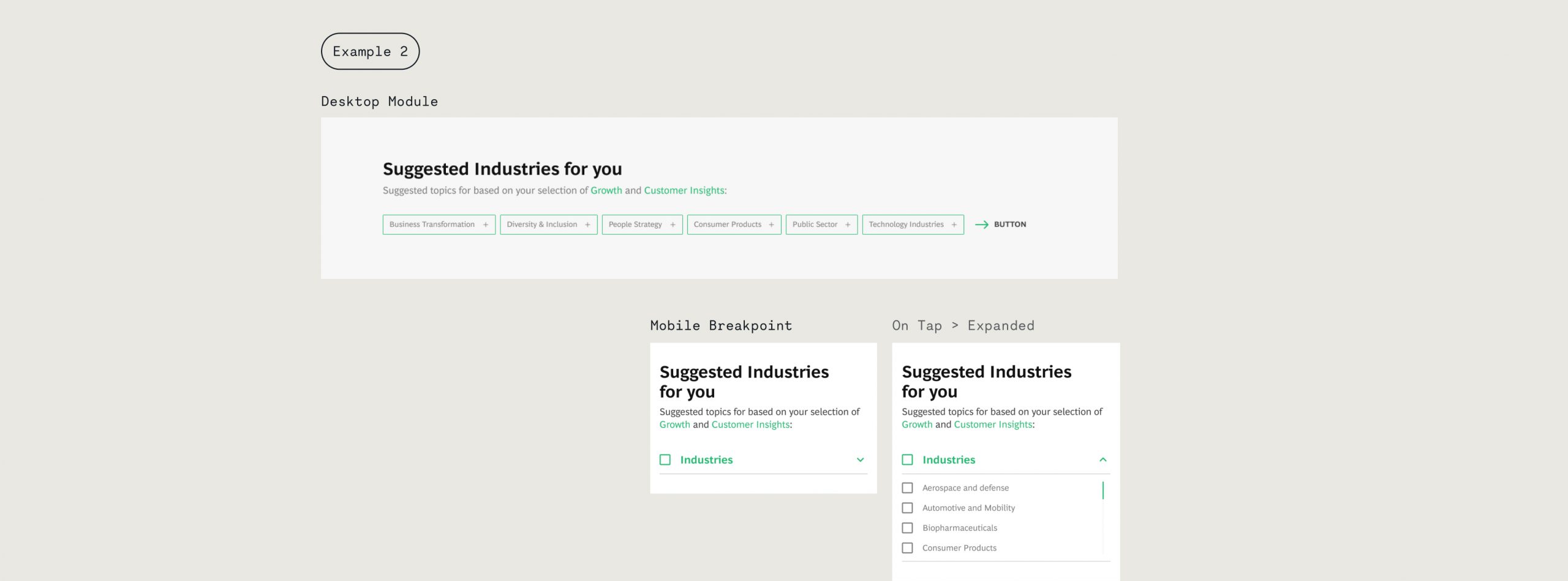
Chips
Chips that help users subscribe with related topics the firm's want to highlight
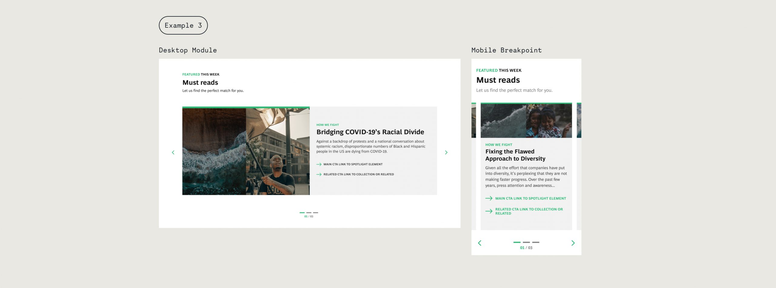
Carousel
A flexible carousel helps promote internal campaigns to aid the user to understand who the firm is and what they believe in
Process Overview
Discover how we got to the solution
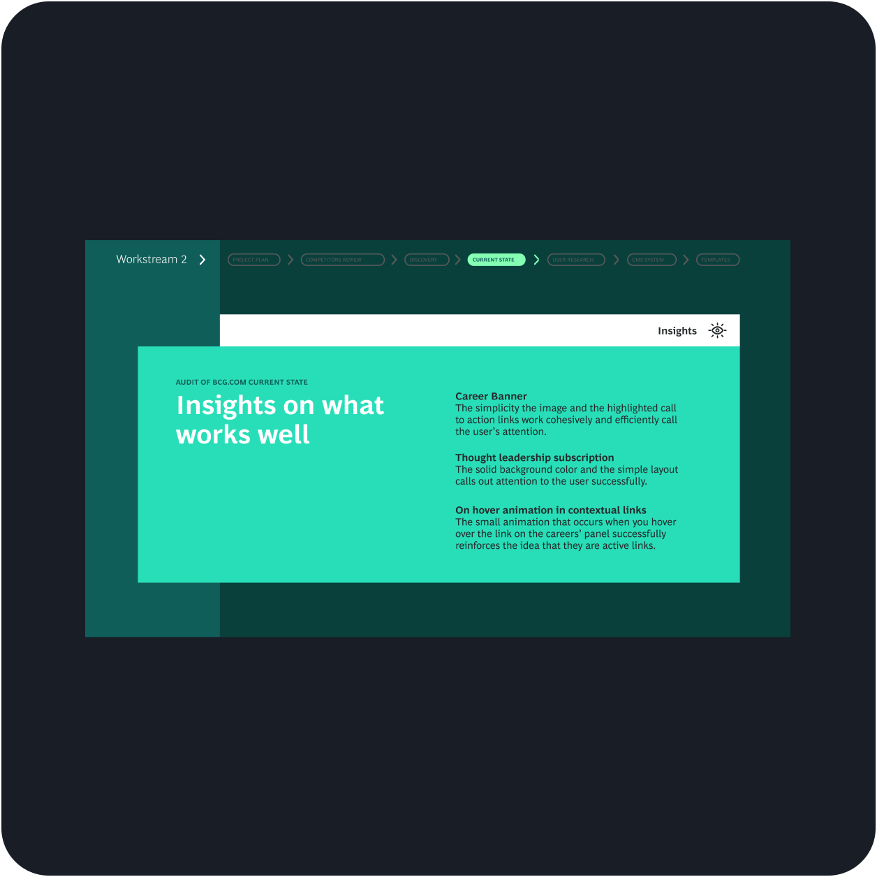
Had learning sessions to synthesize all the information we had about types of users, site metrics, and stakeholder considerations
Why did you take this step?
To gather a deeper understanding of what we had to work with and decipher what we needed to seek out.
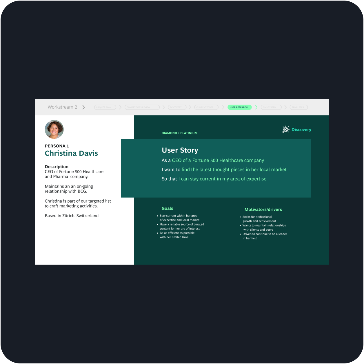
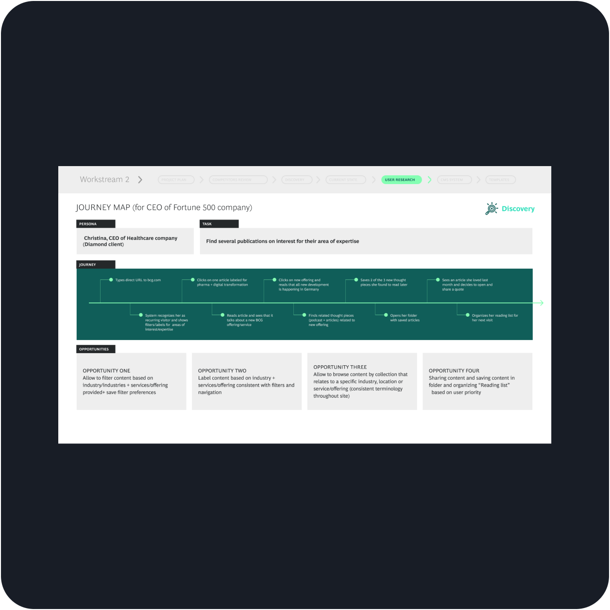
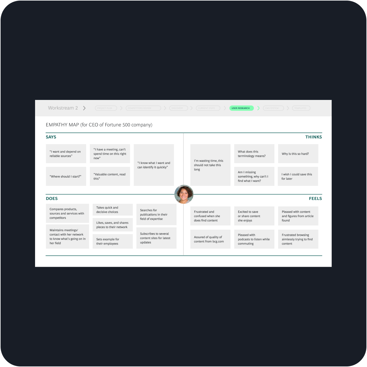
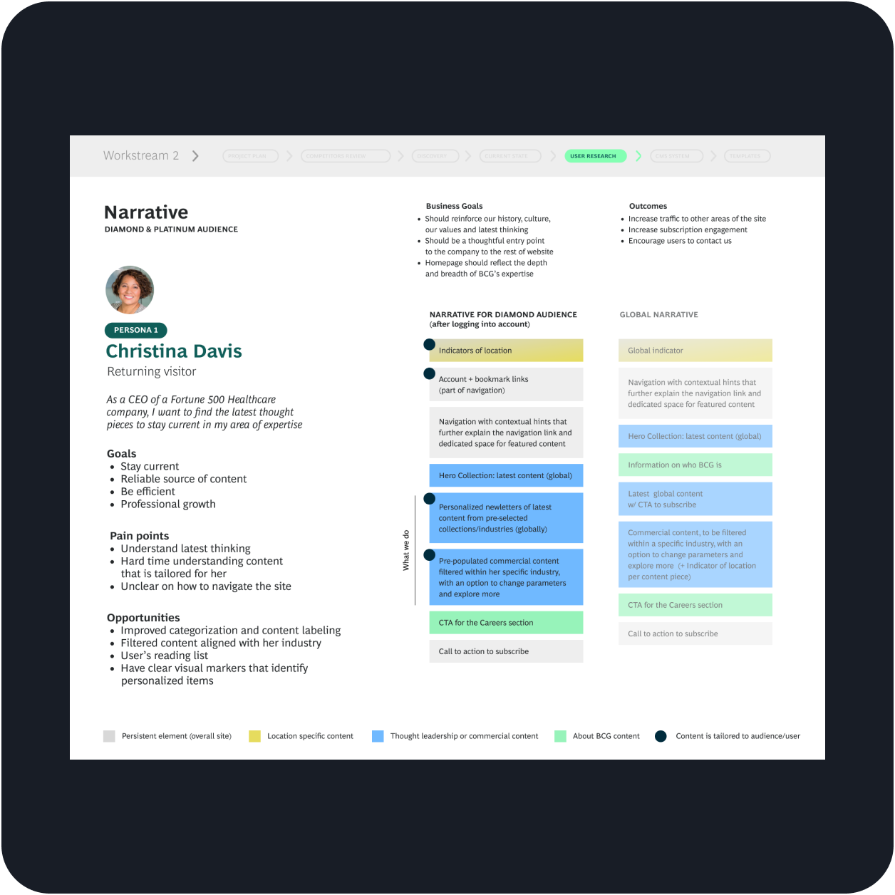
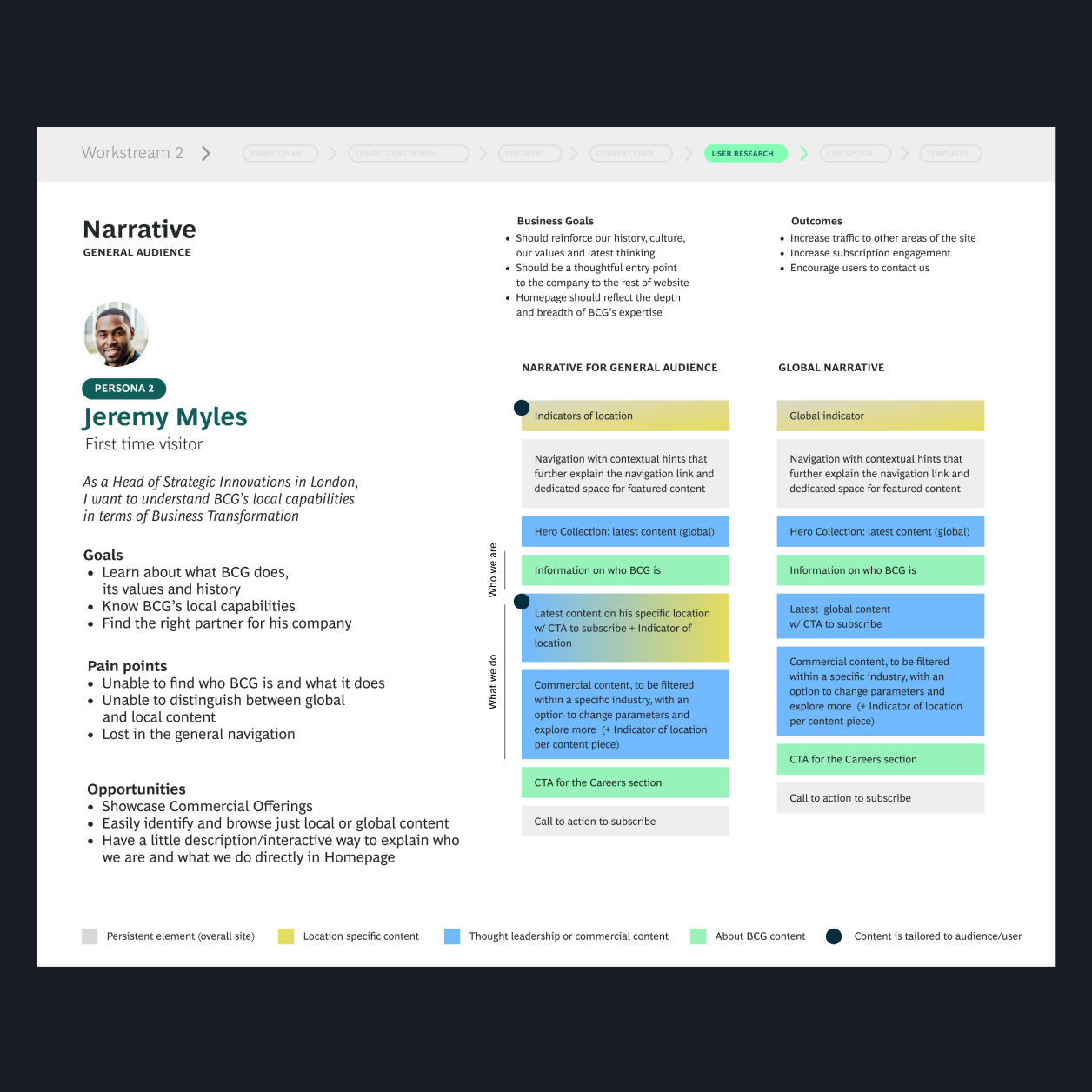
Crafted a set of documents—which include personas, empathy maps, and user journeys
Why did you take this step?
To validate existing pain points and uncover other user needs that were not addressed by the marketing team yet.
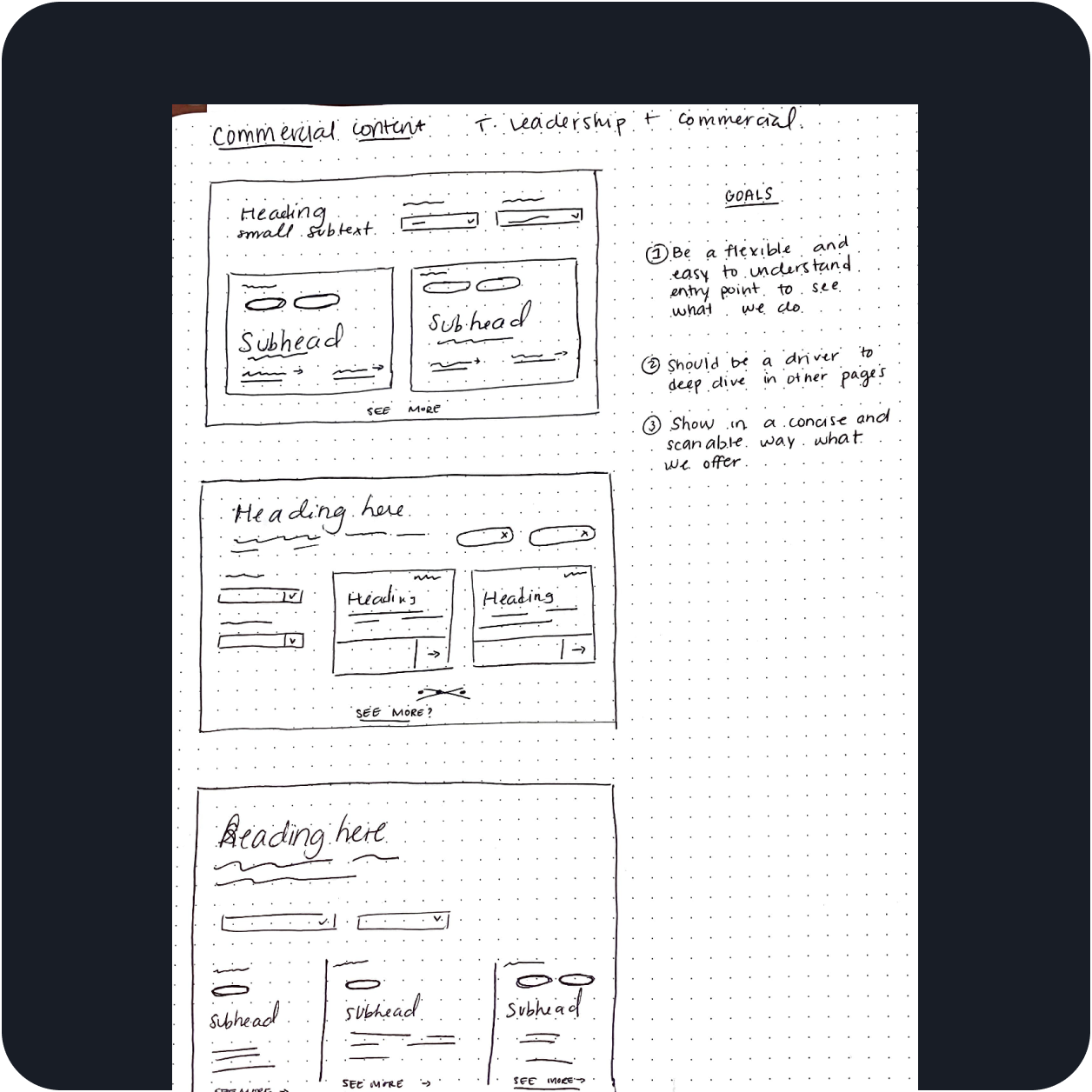
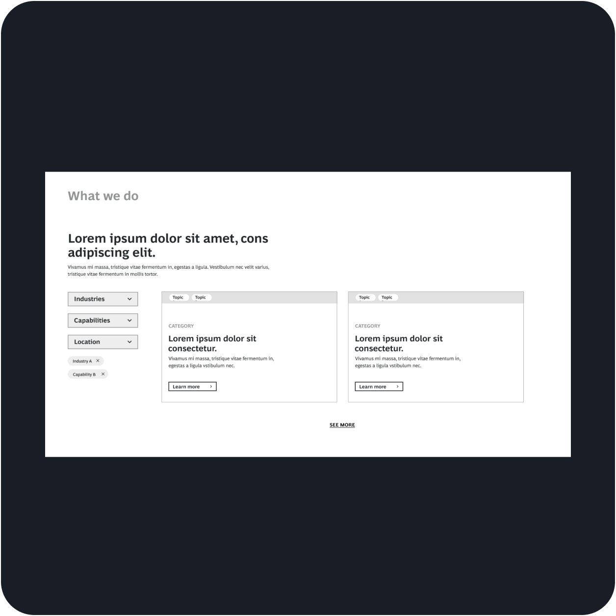
Iterated in a low fidelity way based on key metrics we identified
Why did you take this step?
To get a sense of how each module would look and how they would adapt per audience need. (first-time visitor, returning visitor, signed in visitor)
Final Design Overview
Take a better look at the outcome
↓ What you are looking at is: A screen record of the high-fidelity prototype that contains some of the modules we proposed to improve the home page .
↓ What you are looking at is: One of the modules we built for the hero banner. This module came as a result of the ask to include more thoughtful interactivity to display the top articles.

↓ What you are looking at is: A quick demo of how the flexible module system works. We created individual modules that would stack together to form a flow. We also worked on providing alternate modules that could be interchanged depending on the content that needed to be showcased. These alternate modules came as a solution to one of the business needs we keep hearing—we need more visual variety to show each time we update our content with the latest happenings.
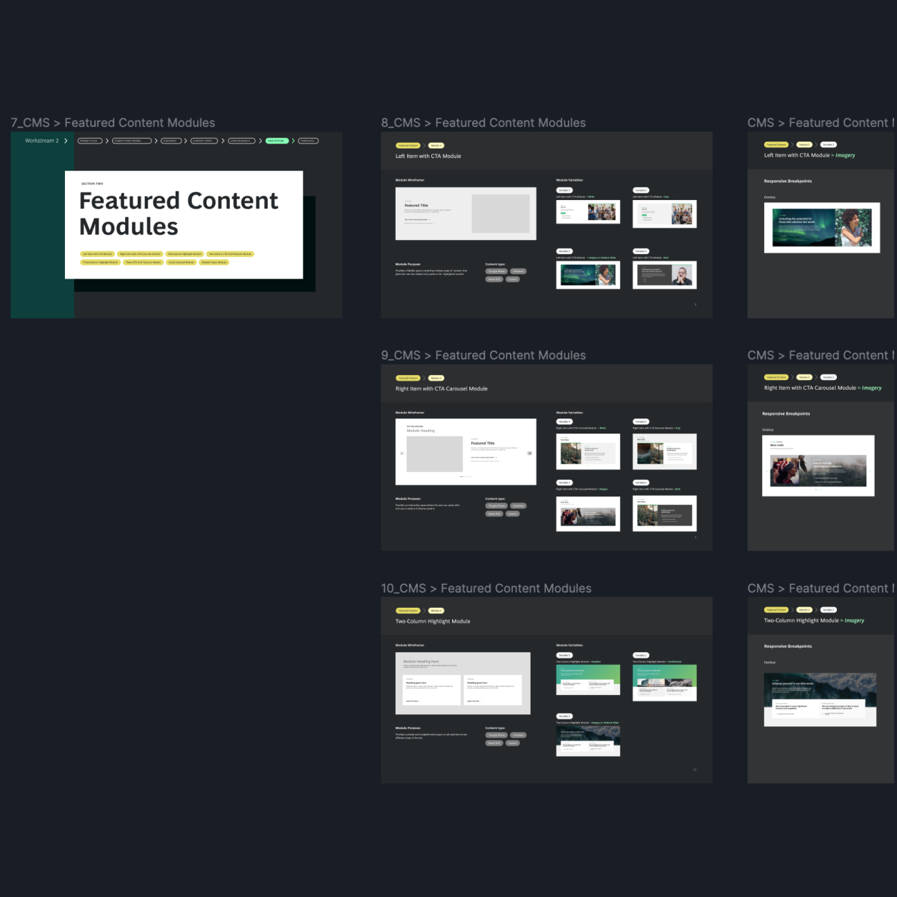
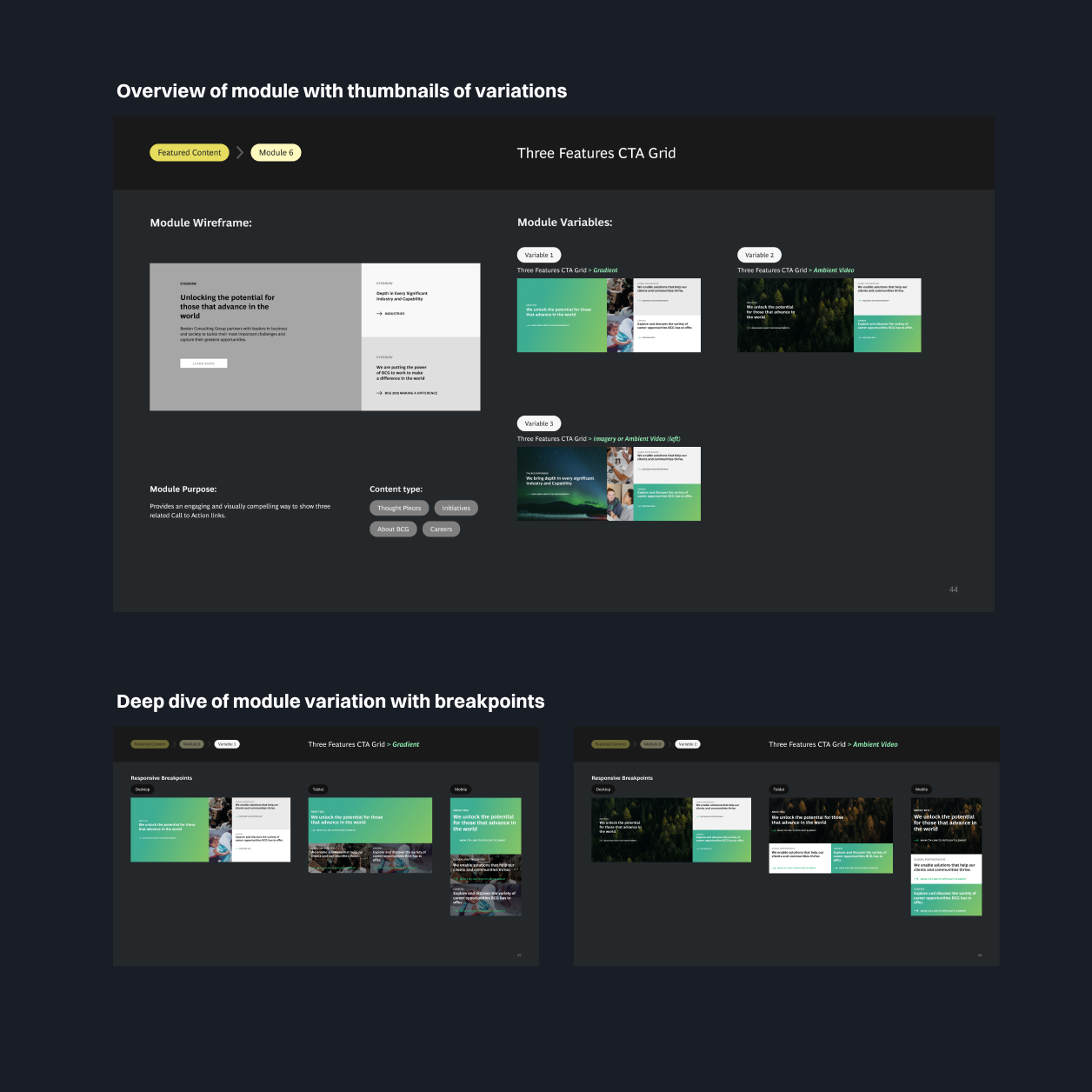
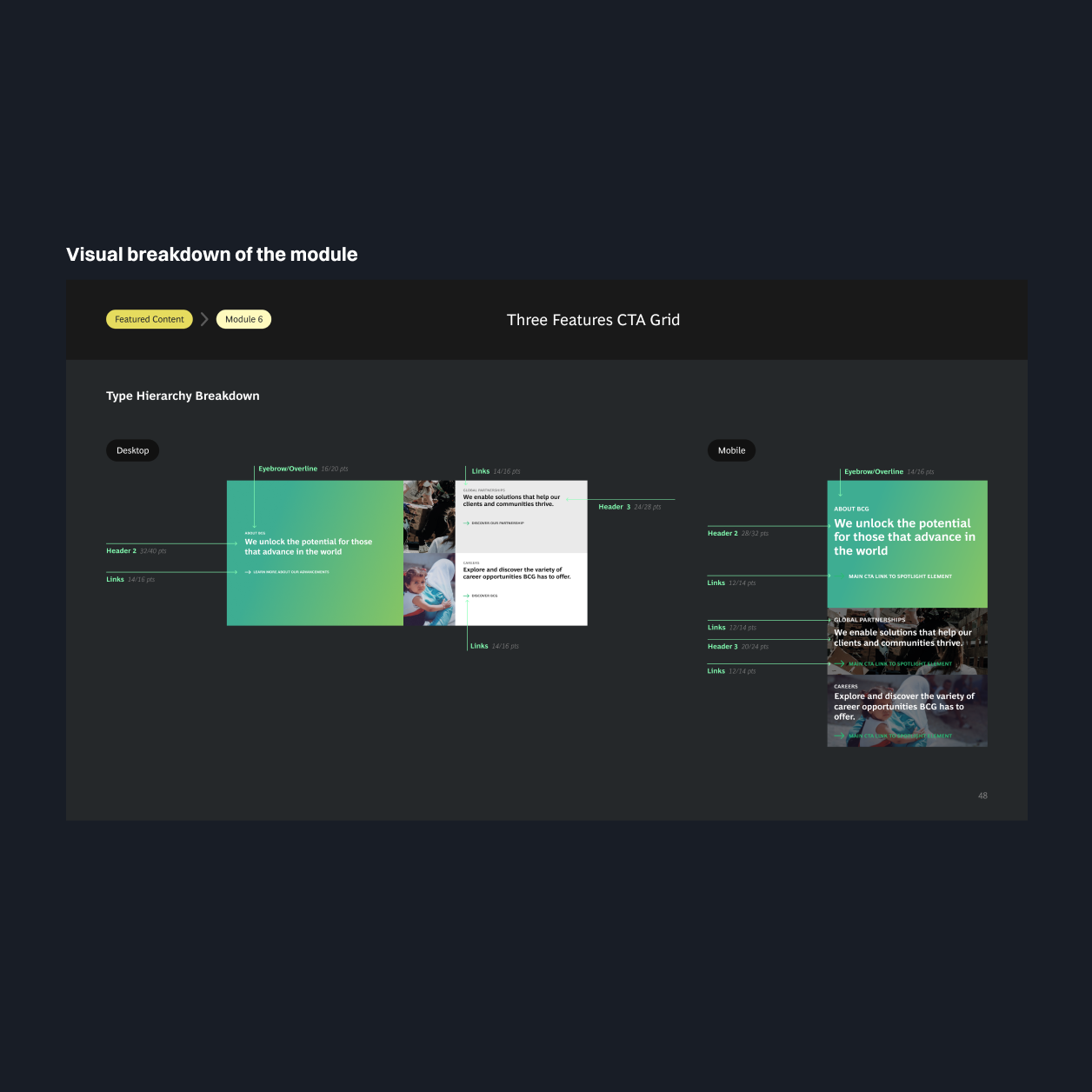
↓ What you are looking at is: A click-through of how the module documentation worked for one of the modules. Each module had: an overview page, a deep dive of breakpoints per visual variation, and a visual breakdown of all design specs.
Brief Outline of Contributions
Understand my role and participation
Synthesized the information from the discovery sessions and created a working plan for the UX phase
This plan helped the team remain on track—while also providing a flexible structure in which we knew what steps to take to gain more user-centric insights.
Helped gather insights that put both our client and users needs at the forefront
Spent a lot of time thinking and having conversations with the designers about possible solutions that would solve the goals for both our client and the users.
↓ Learning Lesson: At this point, I had a vision of how the modules should work and look. Though I had that vision, I learned that I needed to make more space to put aside my perceived solution and to really make space to listen to the client. I actively listened to their feedback, put aside my perception, to ensure I was providing a solution tailored to their needs.
Helped create a flexible design system with modules that would fit in the existing CMS
Strategized a module library with simple modules that could be used interchangeably depending on the marketing team's purpose. This module library solved the business need of having an easy way to visually introduce new content through the home page.
Conceptualized and created the module library that would help the client get buy-in and would aid in the CMS implementation
Ideated and designed a reference document where: marketers could have a macro view of all the possible ways to display their content and where developers could get the specifications they need to implement them.
↓ Learning Lesson: Throughout this project, I kept thinking: “If I were the client, what would I want to receive?” This thought process, which included a great deal of empathy, helped me anticipate their needs and tailor how the final document looked and worked. I will continue to practice this thought process in my future projects because it led to a better and more trustworthy relationship between myself and the client.
Project Outcomes
Find out what happened after we delivered the design
Delivered a set of documents that took into account the client's workflow and pain points
Our client had a set of cohesive reference documents they could use and share internally that made their workflow more efficient and streamlined.
The Dev Team has implemented 5+ modules not only on the home page but across other pages on the site
The development team used our module library to successfully implement the design in the current CMS.
Marketing engaged in the second phase of work—which led us to do more work on user research
Our client was satisfied and engaged us a few months later for additional work on other areas of the website.
Creating for a positive impact.
