

Designing an interface that facilitates a deeper understanding of female puberty
THIS CASE STUDY IS ABOUT:
A prototype of a web-based tool that allows users to sort by age to find out more information about female-related topics like period, hormones, birth control, and others
This case study aims to:
Explain my approach with data visualization and content strategy and how it played a pivotal role in creating an interactive tool that helps users learn more about the female puberty process
this case study will cover:
Project Background
Get some context behind the project
Context
Background
After having a conversation with my dad about my puberty process— I asked myself: "How can I design something to improve this experience of this uncomfortable conversation? This question served as the foundation of the prototype you will be looking at on this page.
Deliverables
Research Documentation
UX Documentation
Coded Prototype
My Responsabilities
Research
Gathered both qualitative and quantitive data to craft the content design strategy
Design
Ideated and conceptualized a simple design system that displayed the complex content into a digestible visualization
Implement
Coded in HTML, CSS, and Javascript a small prototype to validate my established interface against the user pain points
Uncovering the problem
Some of the initial pain points were—

There's an overwhelming amount of data on this topic. I don't know what I need to prioritize all the information.
A lot of the information I'm seeking exists in a very inaccessible language, which requires me to put in more effort to gain a better understanding of the topic.
I have to dig around through a lot of different sources to draw out a conclusion. This laborious process is time-consuming and does not assure me of a successful understanding in the end.

How might we make it more accessible and digestible to understand more about the puberty process of a female?

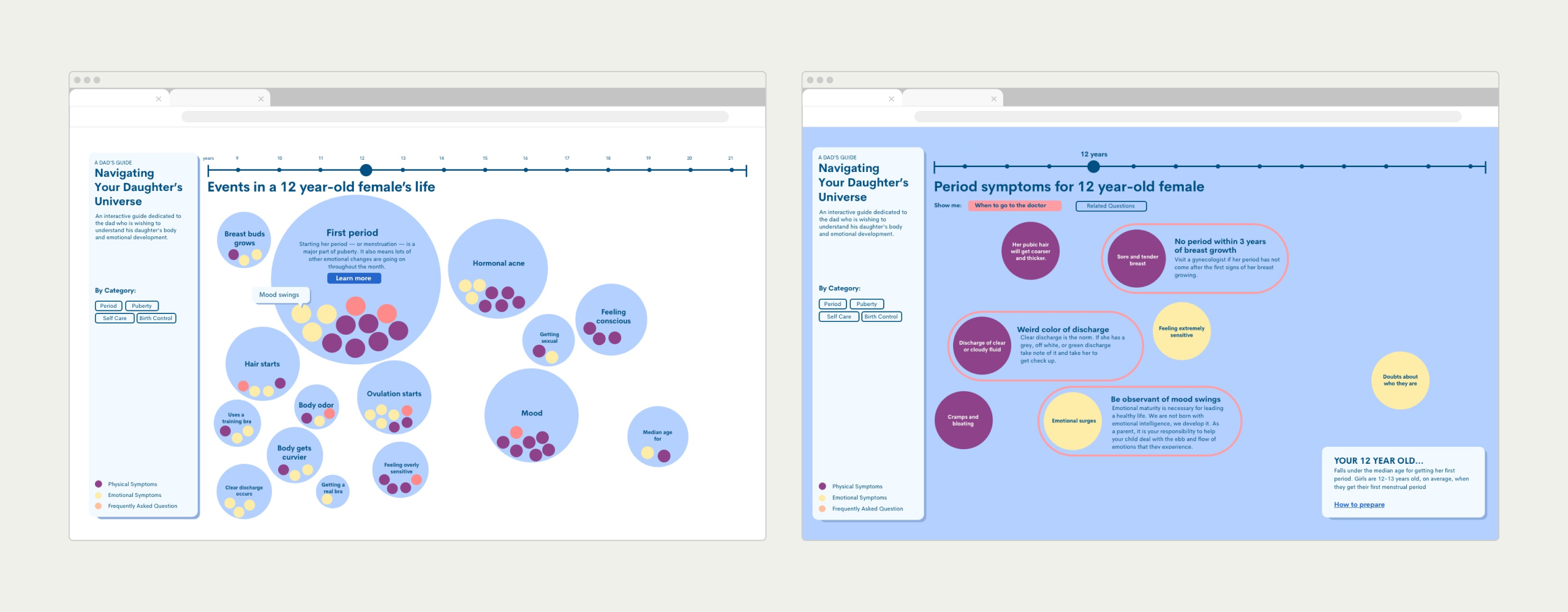
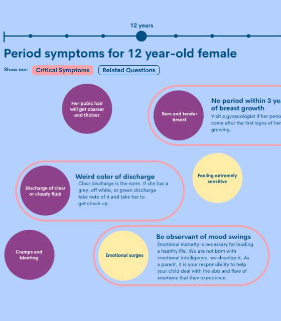
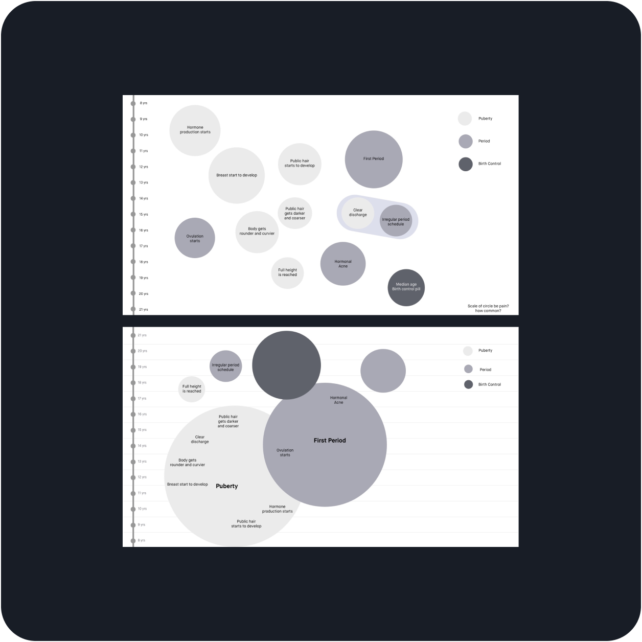
Created a browser-based tool that leverages interactivity, colors, and shapes to visually showcase the physical and emotional symptoms that females experience within puberty.
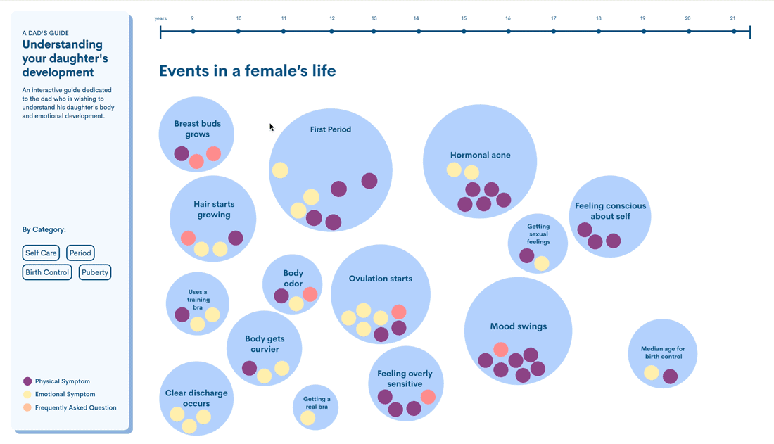
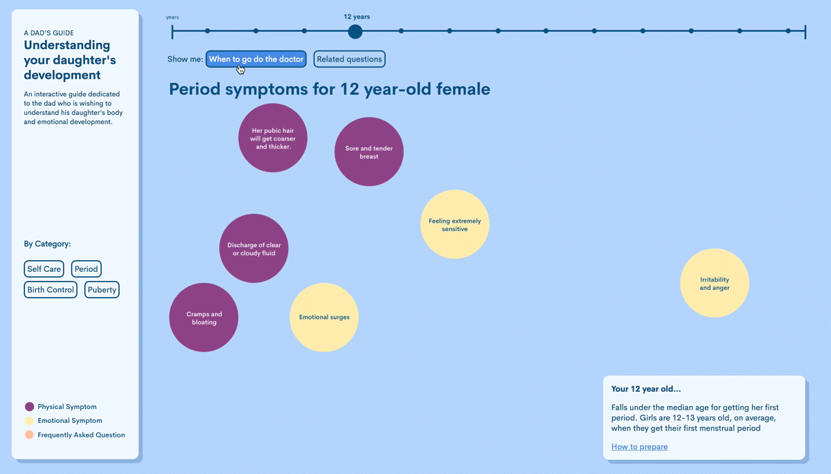
↓ The macro view of this tool shows blue circles that visually represent a major event to expect within a selected age range. Within the main blue circles, the users can see a smaller clustering of color-coded circles. These subcategorized circles represent both the emotional and physical symptoms that fall under that major event of her stage of puberty.
Key Features of the Design
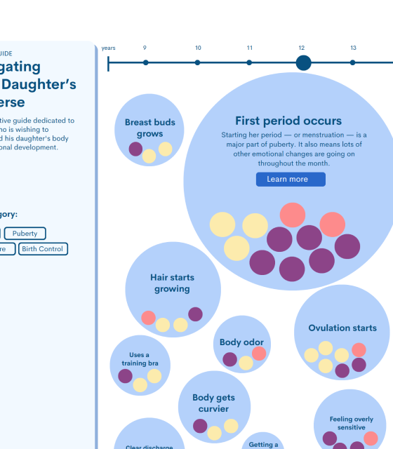
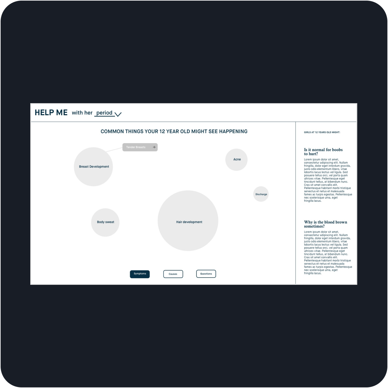
↓ Persistent filter bar that lets the user sort through the information by their selected age
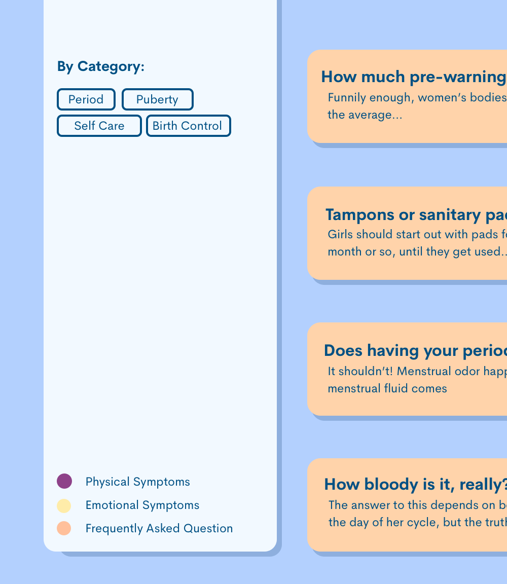
↓ A static side panel that lets you filter the results through different topics like Period, Birth Control, Puberty
↓ A toggle option that alerts the user of the highest-level information they should be aware of in case of visiting a doctor
Process Overview
Steps taken to solve the ask
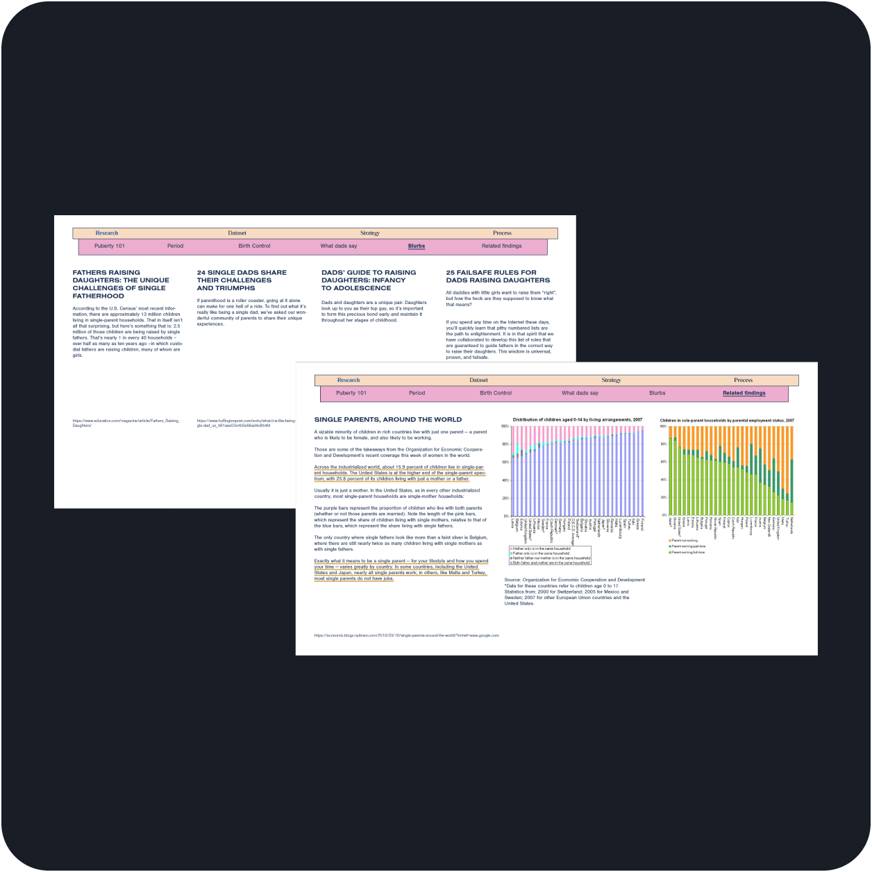

Researched related topics and compiled their data in a working document that I could reference throughout the project
Why did you take this step?
To understand what all information was within this subject matter and start finding areas of simplicity within the content

By taking the time to understand to get to know the subject matter and see competitors, it allowed me to get a small taste of what users experience themselves, thus enhancing how I could empathize with their struggles.
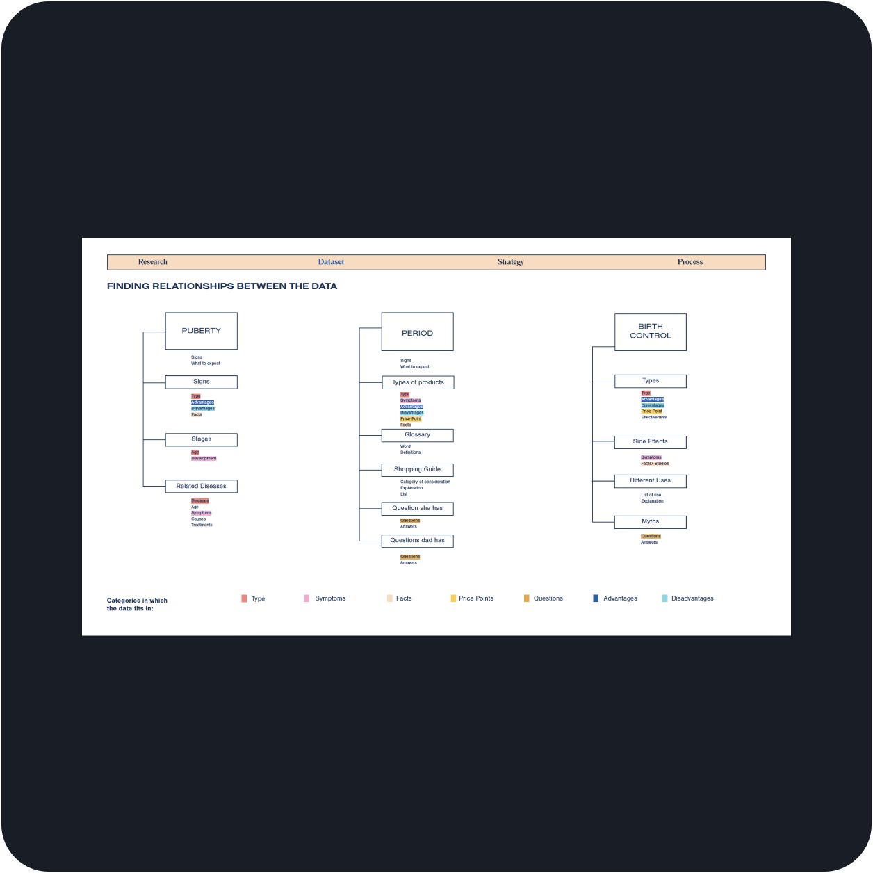

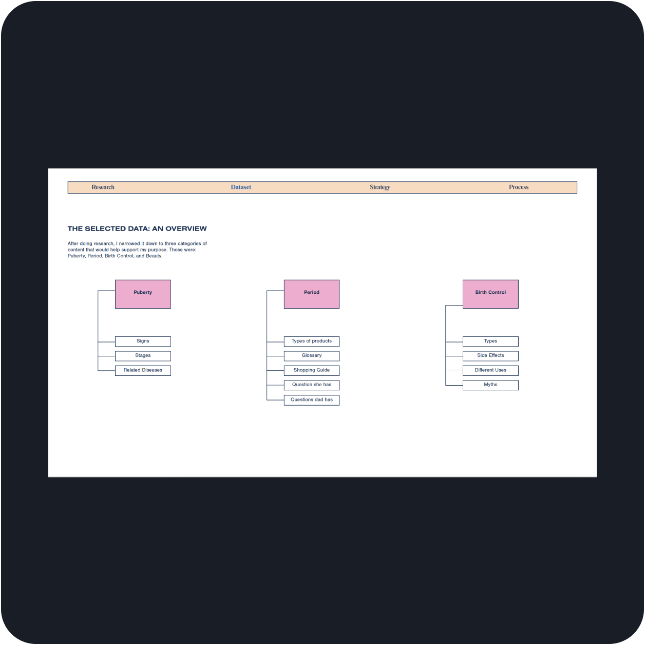
Categorized all of the selected content that would appear within the tool
Why did you take this step?
To simply the extensive content into simplified groups made the information less overwhelming and more digestible.
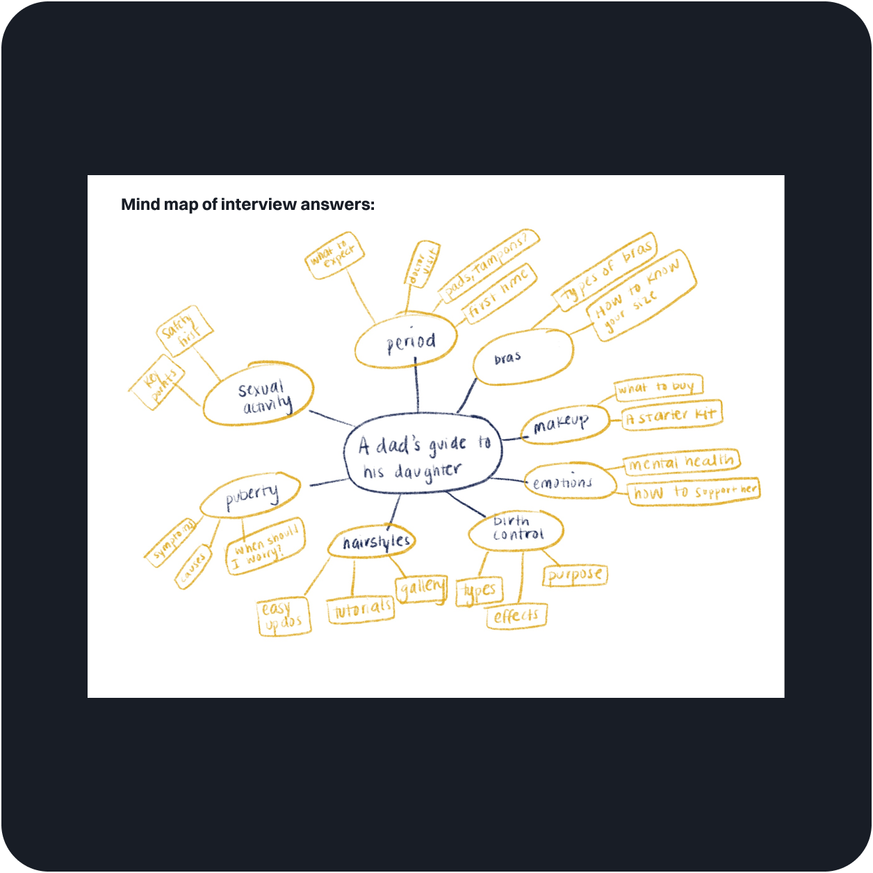

Interviewed a few users and outlined their needs under the pre-established categories in the content strategy
Why did you take this step?
To align both content needs with users. By doing this mind map, I started merging both the content with user needs, making sure they were working cohesively.
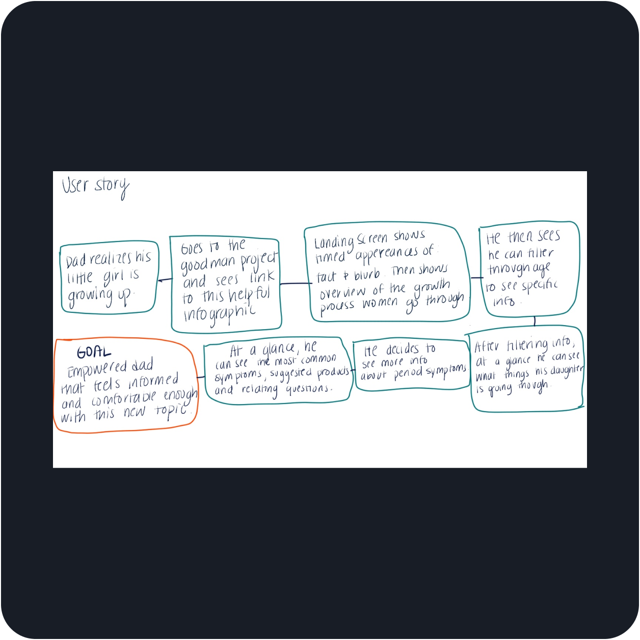

Created a user story that hit on all the prioritized pain points
Why did you take this step?
To establish a sequence that allowed me to have a starting point to design off of
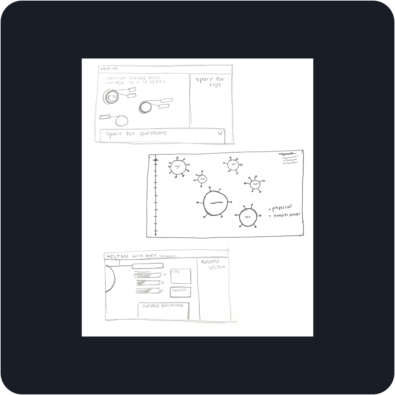

Iterated through sketches and low-fidelity wireframes
Why did you take this step?
To quickly play with different ways to visualize the selected content— in a way that made sense with the user story

Coded a prototype
Why did you take this step?
To visualize the whole experience, test out the interactivity, and validate if I had made a useful experience that solved the needs
Final Design Overview
Take a better look at the outcome
↓ What you are looking at is: A screen record of the coded prototype I developed. It follows the user story I previously outline: A dad with a 12-year-old daughter, who wants to know more information about what happens if she gets her first period.
↓ What you are looking at is: A quick view of the question and answer section that exists under each symptom.
↓ What you are looking at is: A view of how the tool gives hints to the user of when they should go to the doctor.
Project Outcomes
Some of the learning lessons I’m taking from this project–

It's okay that is not going okay
While designing the tool, I was getting frustrated because the design didn't align with the vision that I had in mind. For that reason, I took a step back and came back to it later. This break allowed me to be vulnerable with myself and accept that sometimes getting it wrong is okay. After allowing myself to accept that I was not getting it right, I went back to research. This then sparked the idea that you saw in the visual above.
Test it quickly—it does not have to be perfect.
I created quite a few versions of the tool to find what would make it more visually engaging. While I was iterating, I was getting too hung up on tiny details of the design too early on. Later, I realized, that I had wasted some time perfecting early iterations, which didn't need that refining at all. Now, I allow myself to test things out a bit more freely early on. This allows me to explore more "out there" ideas that could fix the problem more creatively.
Creating for a positive impact.